Choosing an ideal font that resonates with your brand image and appeals to your website design, and is easy to read, is crucial when creating your website.
Selecting a font is more than just for an aesthetic purpose. Besides making your website look more appealing, clean, and attractive, a font significantly impacts your website’s conversion, bounce rates, and user engagement.
A wrong font can negatively impact your website’s user experience, affecting its bottom line. Hence, if you’re at the stage of building a website and confused about choosing a font—you’re at the right place.
In this article, we share some of the best Google fonts you can try for your website per your needs and requirements. But first, let’s try to understand what Google fonts are.
What is Google Fonts
Google Fonts is a free and open-source library comprising hundreds of high-quality fonts in over 135 languages.
This library has come a long way, from 19 fonts since its launch in 2010 to over 1450 fonts today. You can filter and choose the different fonts based on their weights and families.
Google Fonts provides plenty of information regarding each font, including the font’s designer, trends and usage, and related work. You can use Google fonts for branding, marketing, and commercial purposes, and they are highly compatible with both iOS and Android devices.
With that, let’s look at the fifteen best Google Fonts you can use for your website.
1. Roboto
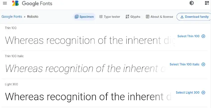
Roboto is one of the most popular and dual-purpose fonts, initially designed by the Google designer Christian Robertson to replace Android’s prior Droid font.
It has a geometric shape, clean appearance, and clean curves, and easy to read, and is highly popular amongst graphic designers and web developers. Roboto comes in 12 styles and has been used as Google’s Android operating system’s typeface since 2014.
2. Open Sans
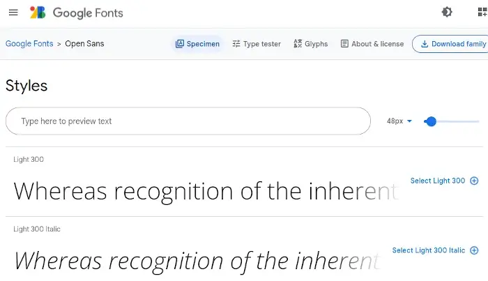
Open Sans is a Google Font that provides a user-friendly interface with a super-readable user experience. It’s one of the free sans-serif fonts that can be sued for any purpose, especially for headings and body text.
Created by Steve Matteson, the open sans font is available in 13 styles and is optimized for mobile, web, and print. Because of its seamless readability, open sans is the default font for the Divi website builder.
3. Lato
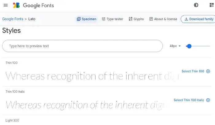
Lato is a multi-purpose Google font that has both a professional and friendly nature.
It’s one of the distinctive sans serif fonts designed by a Warsaw-based designer Lukasz Dziedzic for both smaller and larger-sized texts.
Lato translates to ‘Summer’ in Polish, is Google Font’s one of the most-used and popular typefaces for body text. This professional, clean, and unique Google font is available in 18 different weights.
4. Oswald
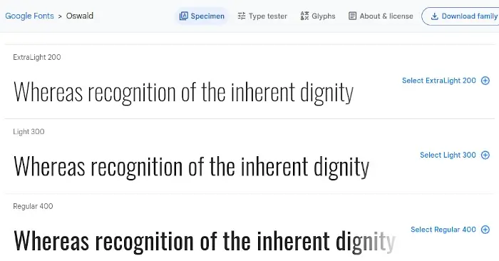
Oswald is developed by Vernon Adams. It’s a sans serif font that’s a rework of the classic ‘Alternate Gothaic’ typeface family font from the 20th century.
It’s primarily designed for digital use purposes for the web and mobile devices and is an excellent font for headings due to its bold appearance.
Oswald comes in 7 weights, including light, extra light, medium, regular, bold, semibold, and heavy regular.
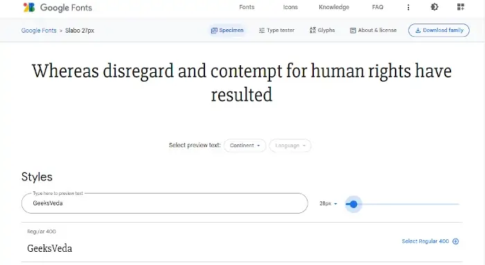
5. Slabo 27px
Slabo 27px is a sans serif font designed by Tiro Typework’s John Hudson.
It comes in only one style, which is Regular, but it comes in different sizes, including 21px, 16px, and 13px, depending on your particular needs and requirements.
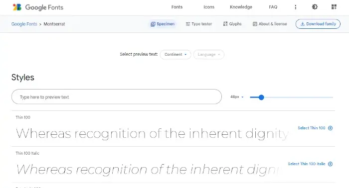
6. Montserrat
Montserrat is a contemporary sans serif font designed by the designer Julieta Ulanovsky. It’s a highly versatile font that comes in 36 different styles and weights, including thin to black, light to heavy, and corresponding italics.
The font was inspired by the historic neighborhood of Montserrat of Buenos Aries in the 20th century.
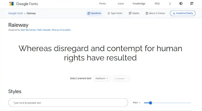
7. Raleway
Raleway is an elegant and thin Google font created by Matt Mclneryney, Rodrigo Fuenzalida, and Pablo Impallari in 2012.
It belongs to a larger family of the sans serif font and comes in 18 styles, including thin, regular, light, medium, bold, semibold, ExtraBold, and black.
It’s one of the most popular fonts amongst designers due to its versatility and flexibility to blend well with modern and classic fonts.
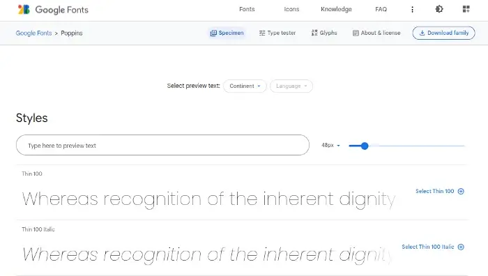
8. Poppins
Poppins is one of the newer Google Fonts developed in 2014 based on the Latin and Devanagari scripts and writing systems.
It’s highly suitable to use for bold titles and headings as they stand out, especially when used on contrasting backgrounds. It’s a geometric font designed by Ninad Kale and Jonny Pinhorn, available in 150 languages, including Sanskrit and Hindi, and 18 styles, from thin to black and light to bold.
9. Inter
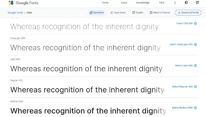
Inter is a Google font that is specifically designed for computer screens, initially published and launched with the name Interface.
It primarily came into the talks in 2017 and is referred to as a mix or cross between San Fransisco Pro and Helvetica. Inter comes in 9 different styles, including thin, regular, medium, bold, semibold, and more.
10. PT Sans
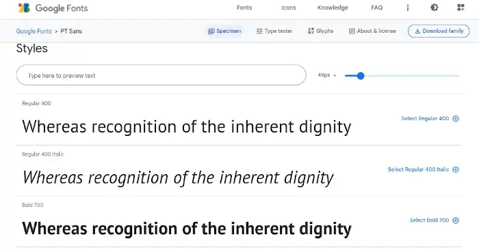
Developed by ParaType of the Russian Federation, PT Sans is one of the popular Google fonts that include both Cyrillic and Latin characters.
Besides PT Sans, the PT family consists of multiple other fonts, including PT Serif, PT Sans Narrow, PT Mono, and PT Sans Caption.
11. Merriweather
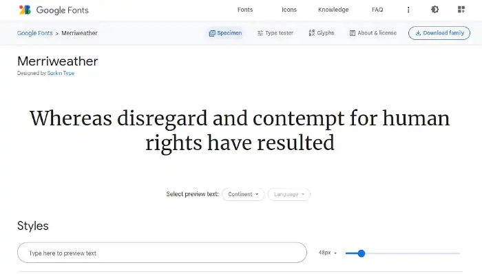
Merriweather is a playful, friendly, and serious font that comprises tall and condensed letters, yet the font is easy-to-read and suitable for all screen types and devices.
Designed by Eben Sorkin, Merriweather ensures high readability. Its large X-height improves the font’s legibility, making it ideal for titles and large headlines.
Merriweather comes in 8 different styles, including Regular, Light, Bold, Bold Italic, Black, Black Italic, Italic, and Light Italic.
12. Roboto Slab
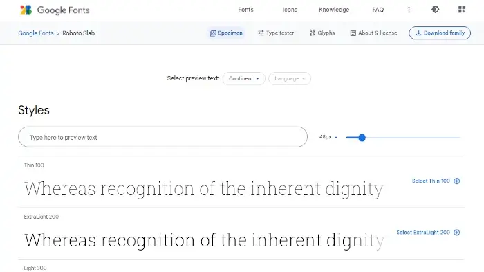
Roboto Slab is designed by Christian Robertson and belongs to the popular family of Roboto.
The Roboto Slab version consists of four different weights, including Light, Thin, Regular, and Bold.
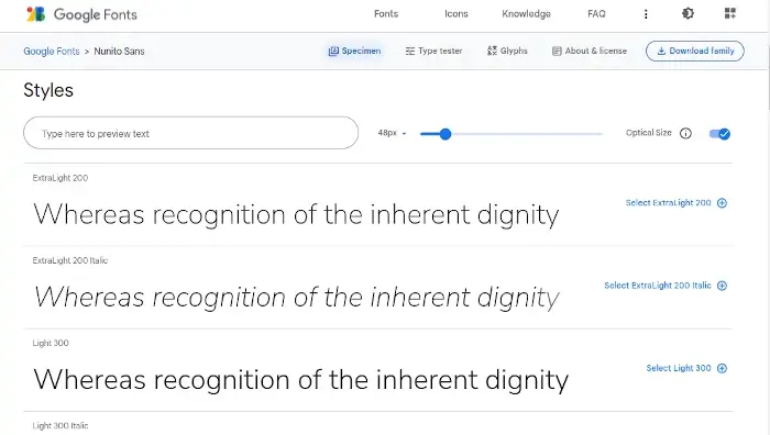
13. Nunito Sans
Nunito Sans is one of the fastest-growing Google fonts, whose use has tripled between 2018 and 2019.
The font is designed by multiple designers, including Vernon Adams, Manvel Shmavonyan, Jacques Le Bailly, and Alexei Vanyashin, and is only growing in use and popularity day by day. The font comes in around 18 styles, including Medium, Bold, Light, Light Italic, Semibold, and more.
14. Work Sans
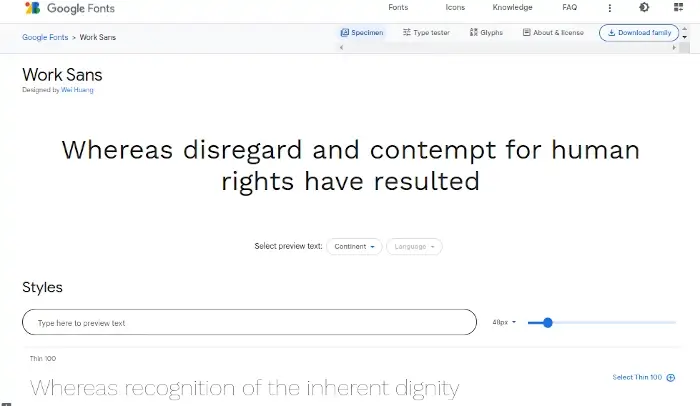
Work Sans is designed by Wei Huang and is a sans serif font optimized for screen use purposes.
It comes in distinctive weights designed for different uses. For instance, while the lighter and heavier weights are optimized for screen display purposes, the medium and regular weights are optimized for text uses.
However, designers typically recommend middleweight font styles, ranging anywhere between 14px-48px.
15. Karla
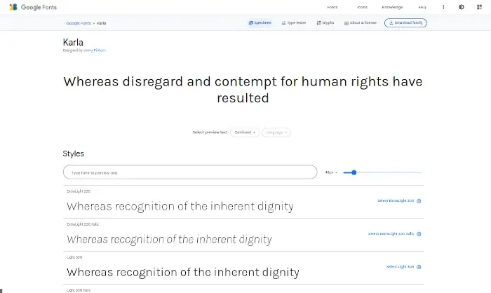
Karla is another popular Google font designed by Jonny Pinhorn.
It comes in 14 styles, including ExtraLight, Light, Regular, Medium, Bold, Semibold, and more.
Conclusion
Google fonts provide a pleasant, accessible, and seamless user experience for web users and website visitors, making your website more attractive and engaging.
However, when designing your website, it’s critical to follow the best font practices, which include hosting fonts locally, limiting the font weights, and trying to stick to accessibility guidelines.
So, ensure you check out and try the Google fonts mentioned in this article to choose the one that best matches your brand’s persona, style, and image. Good luck!
